PROBLEM:
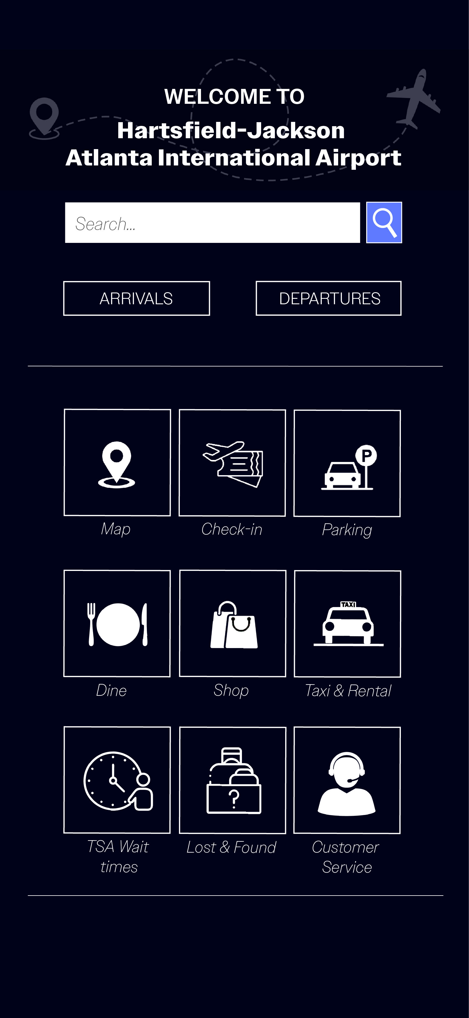
Travelers navigating Hartsfield-Jackson Atlanta International Airport face cognitive overload and wasted time because apps bury critical flight, gate, and security information beneath cluttered, uniform layouts.
SOLUTION
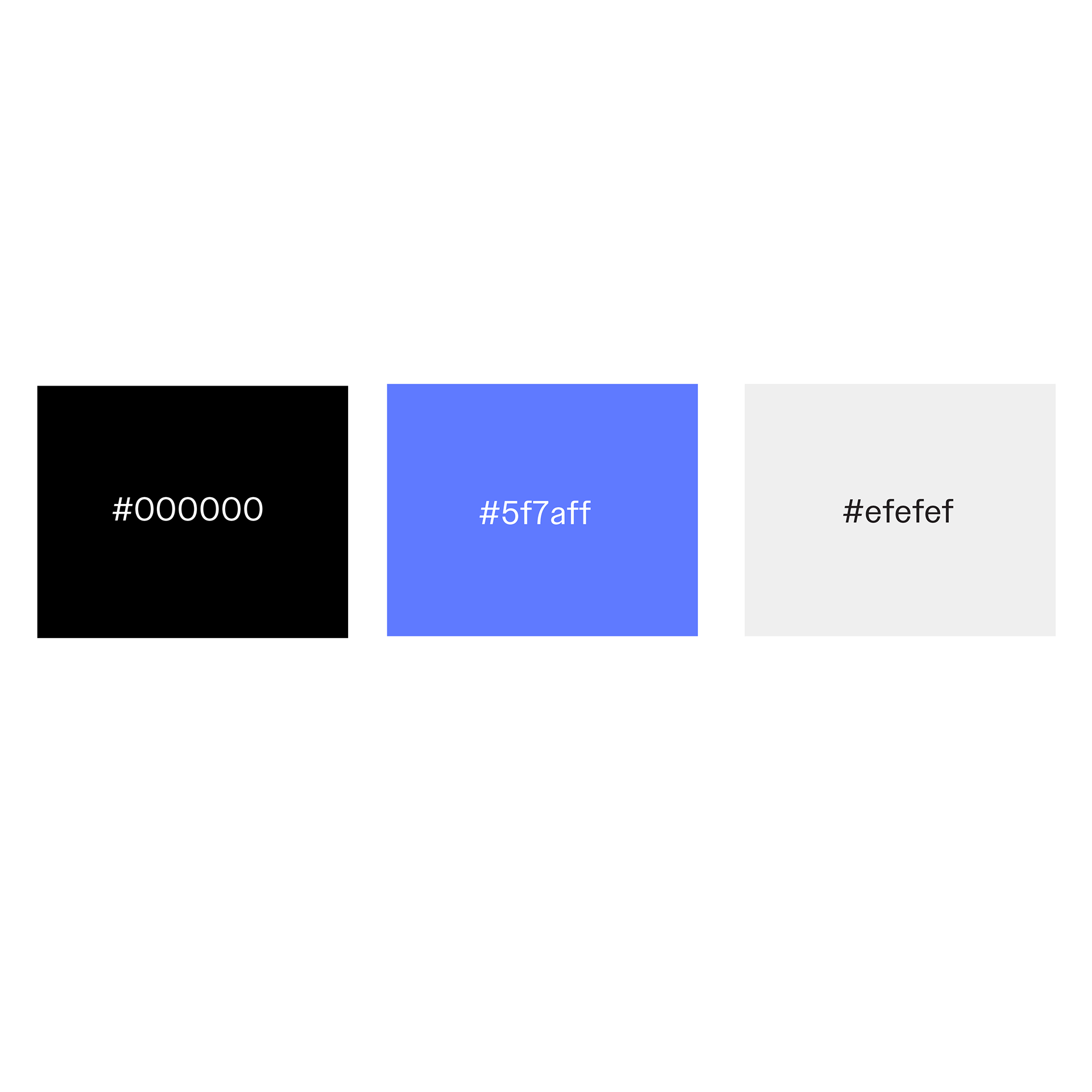
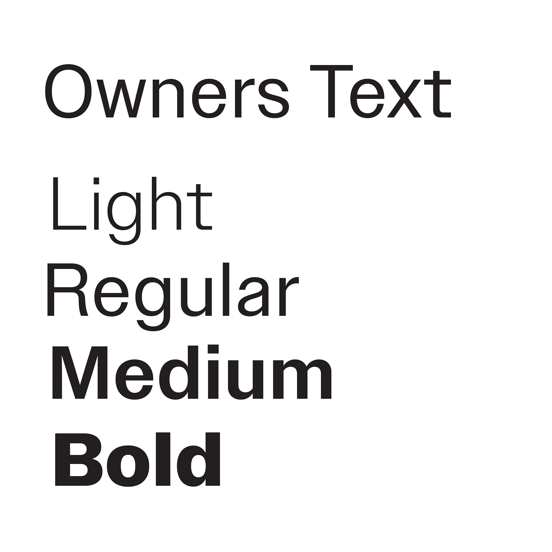
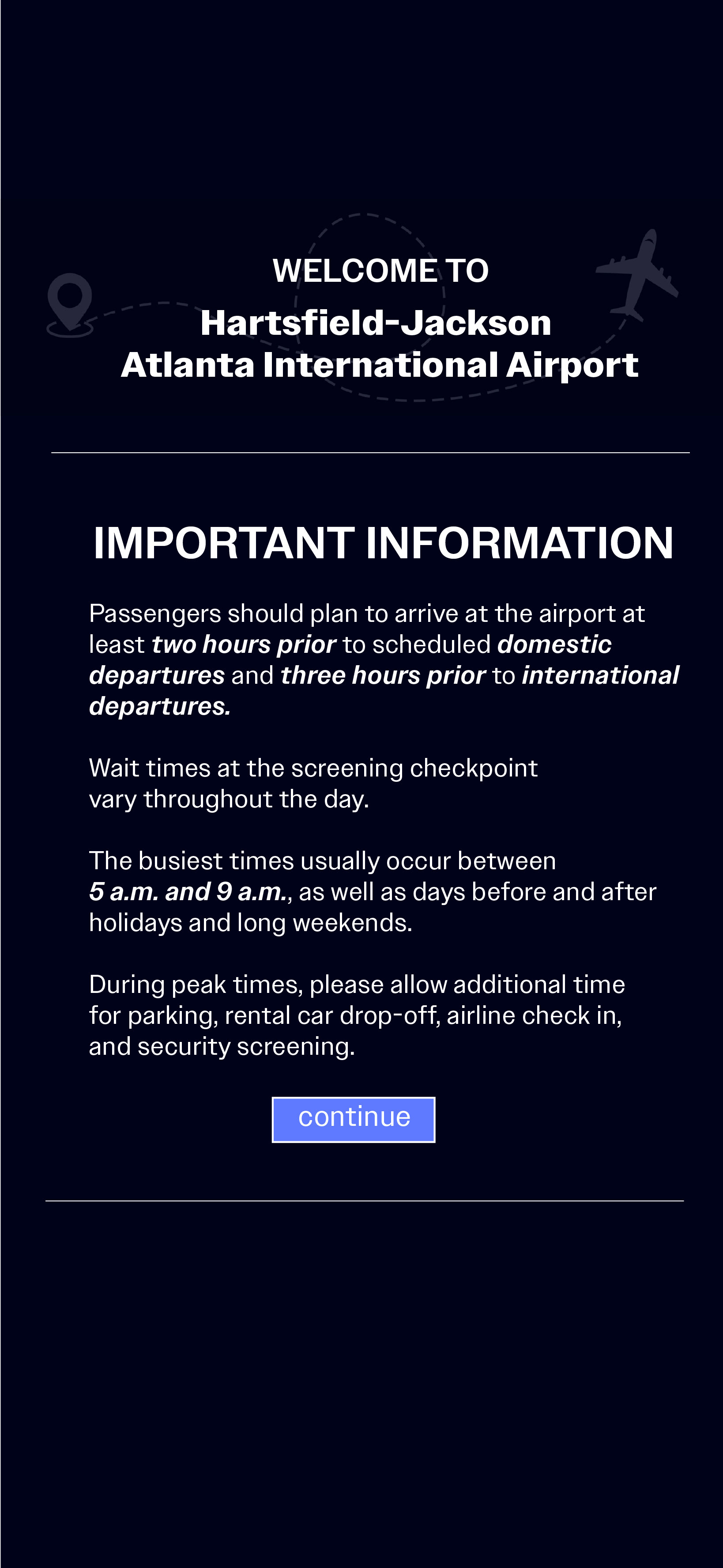
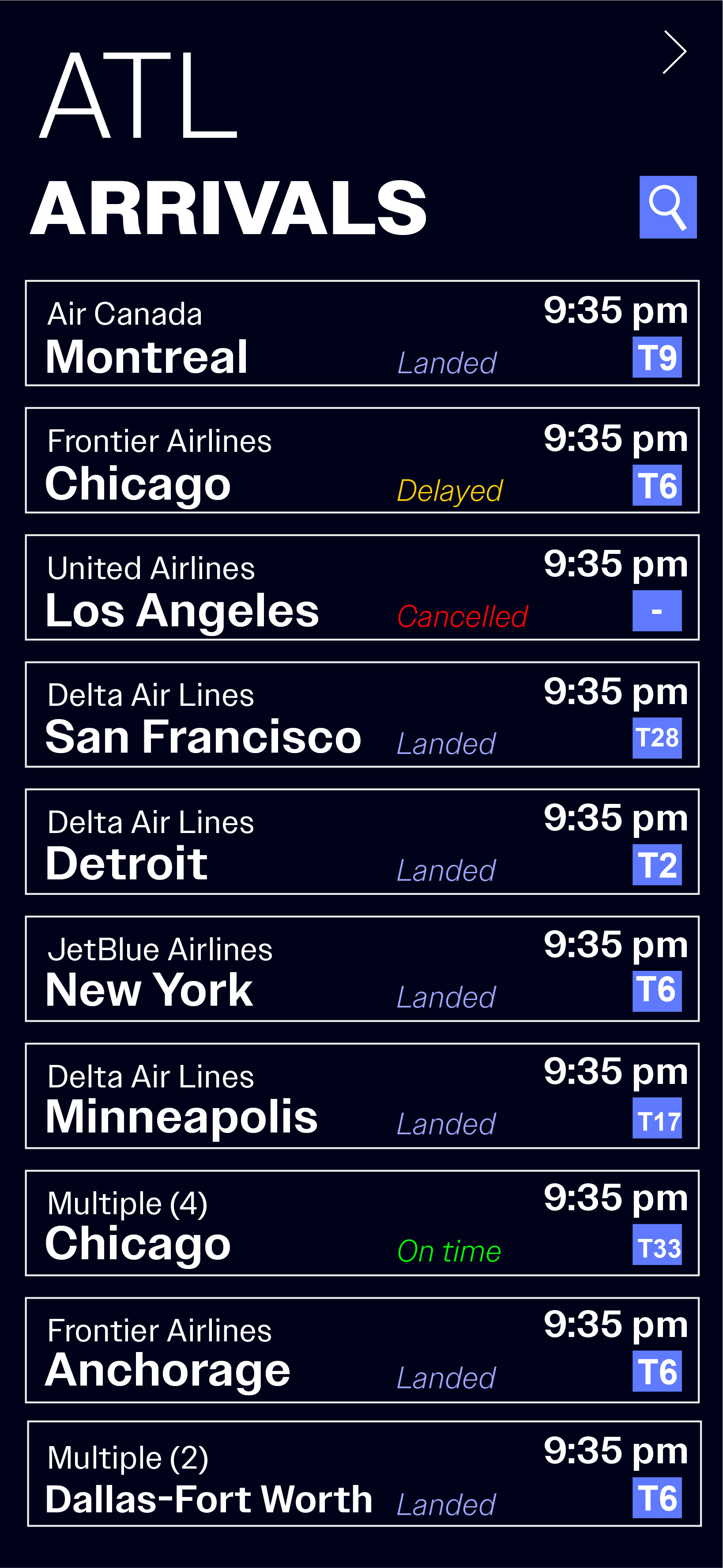
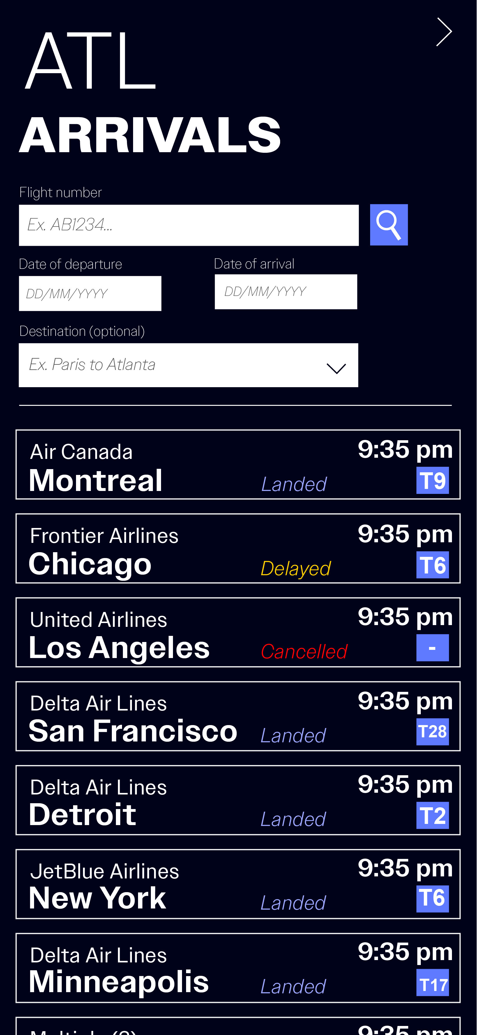
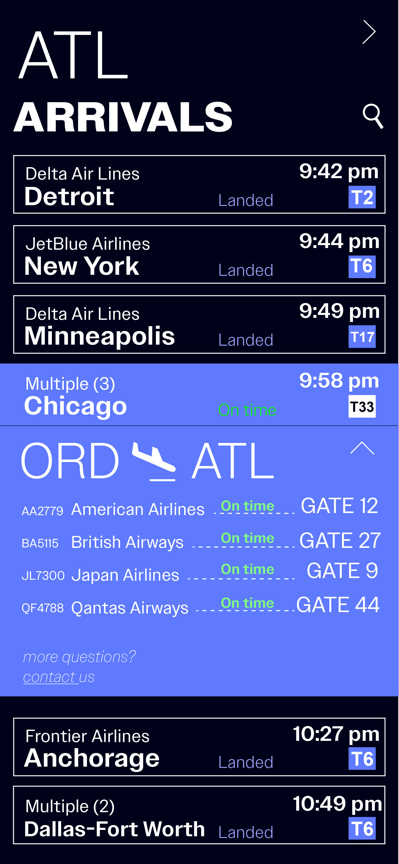
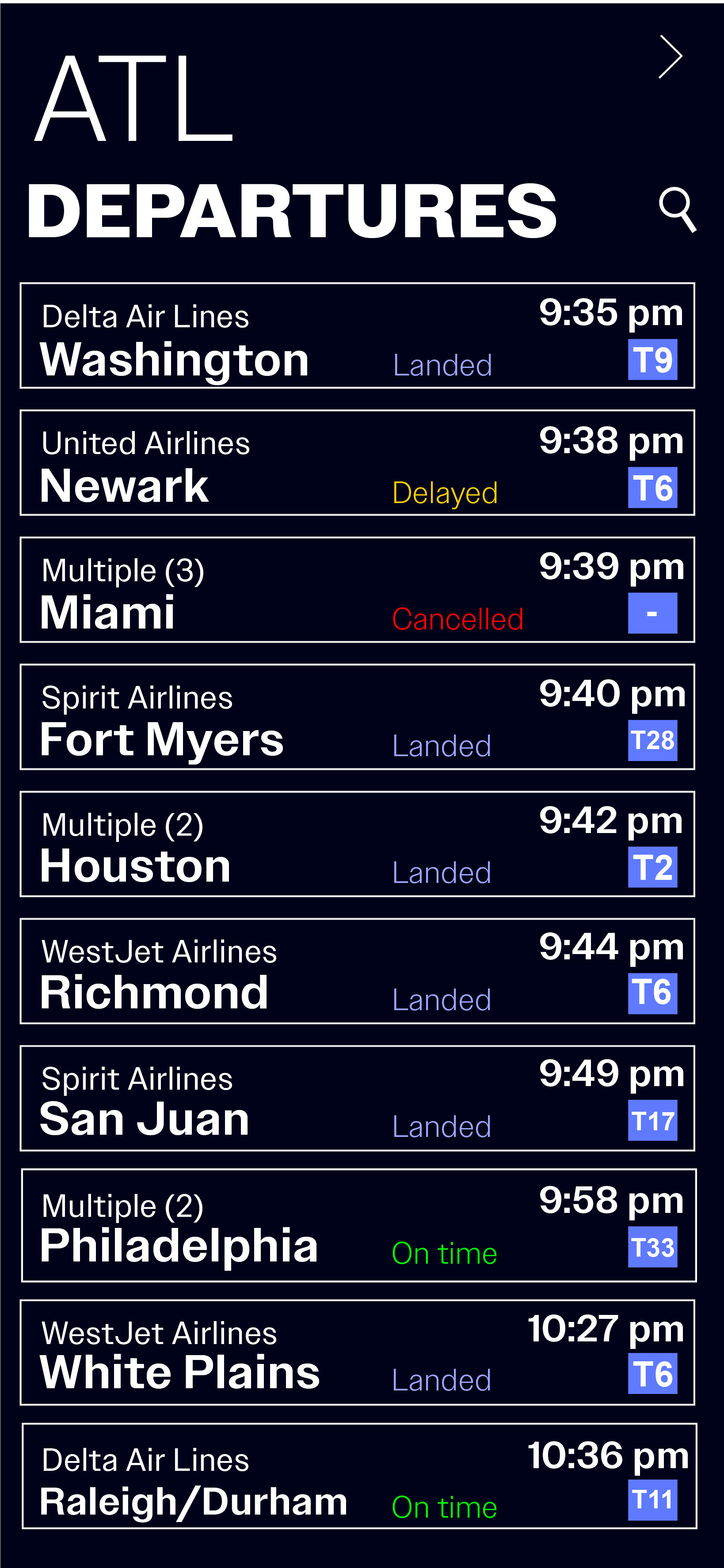
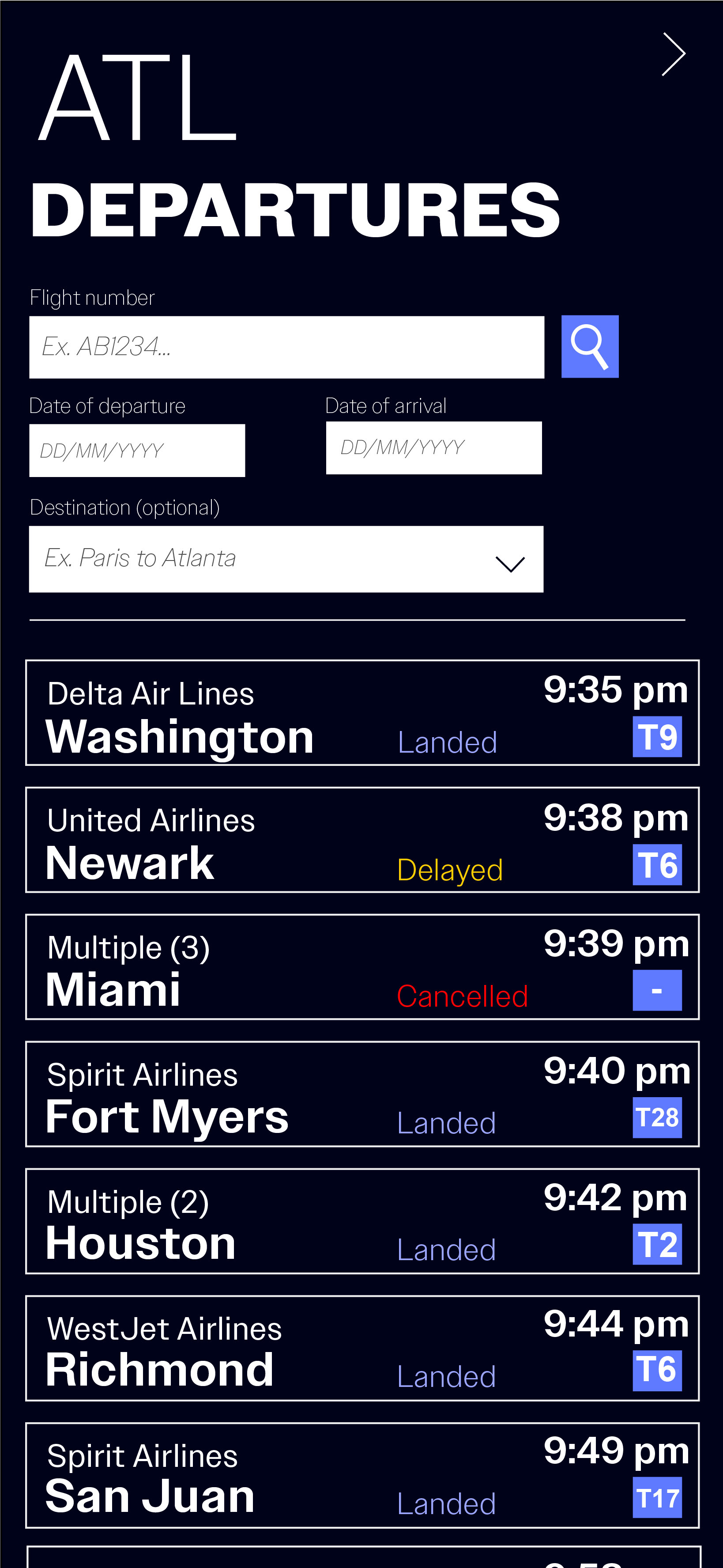
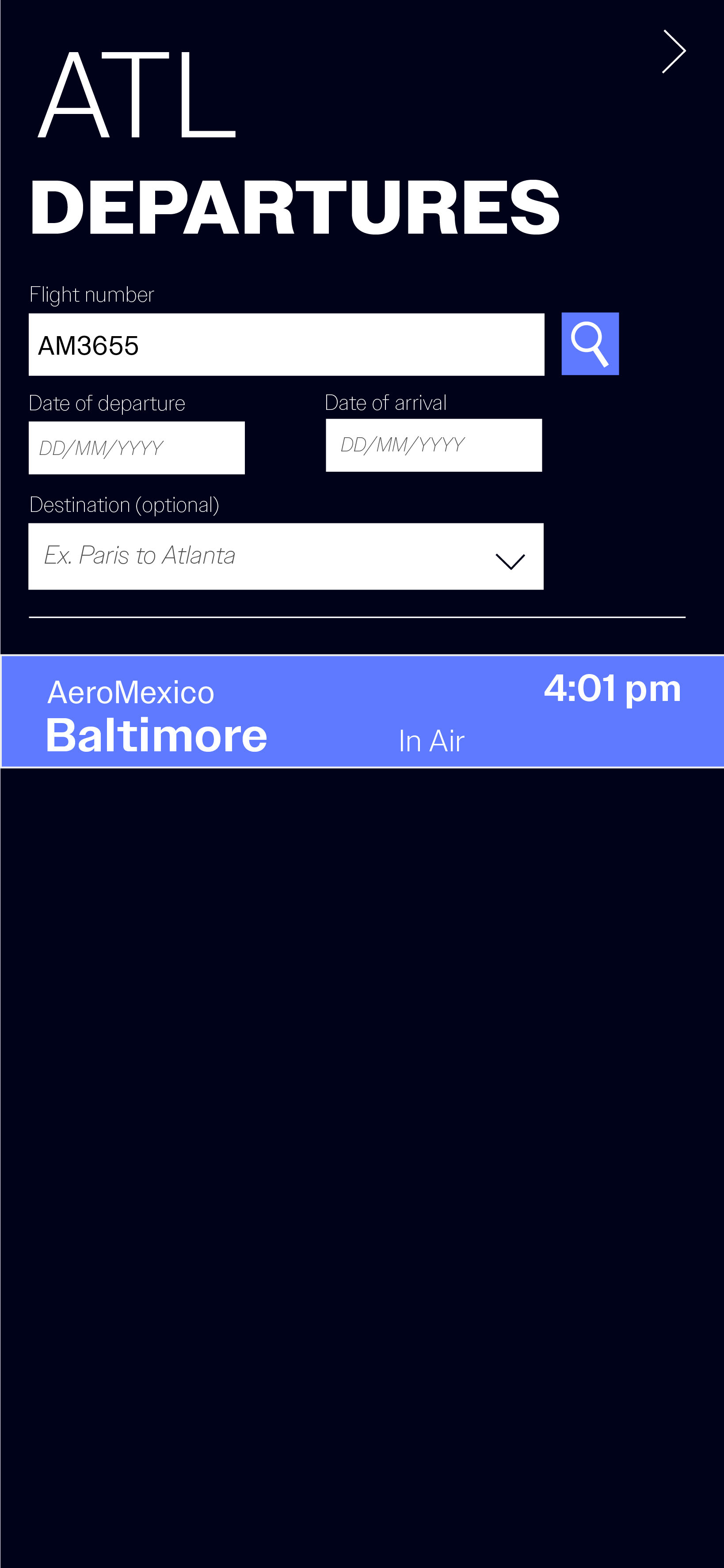
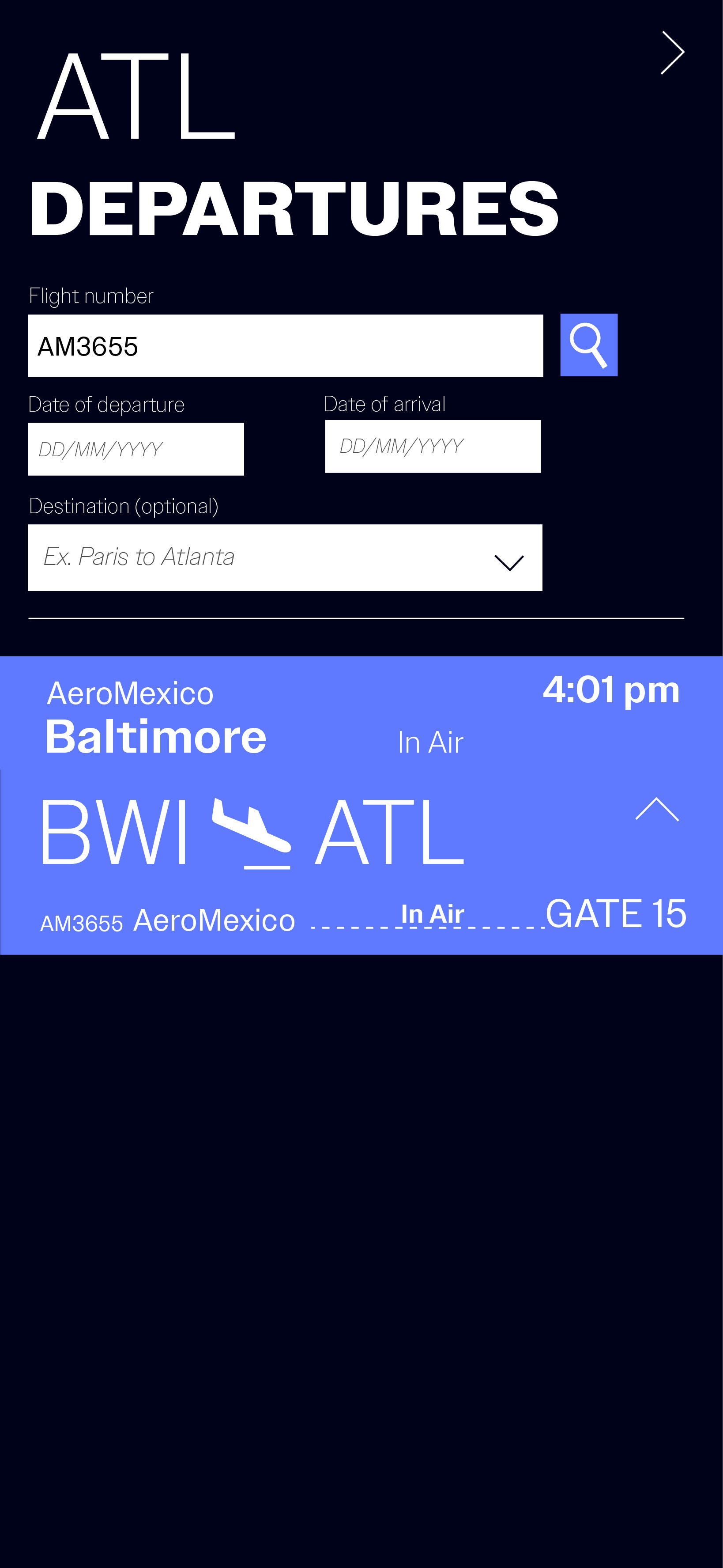
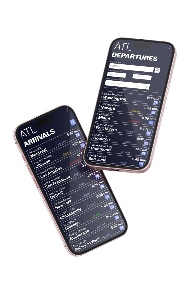
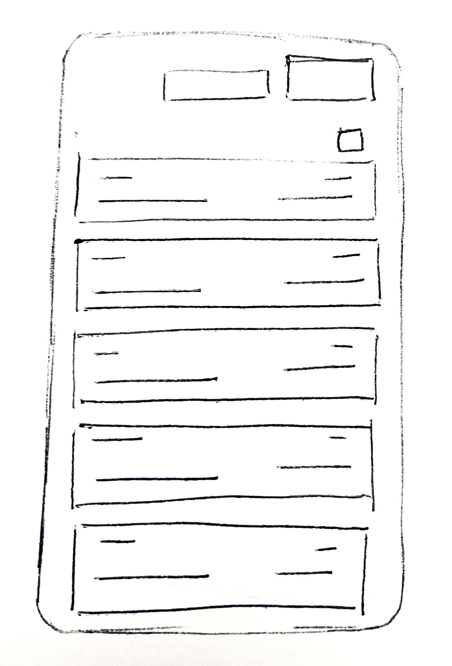
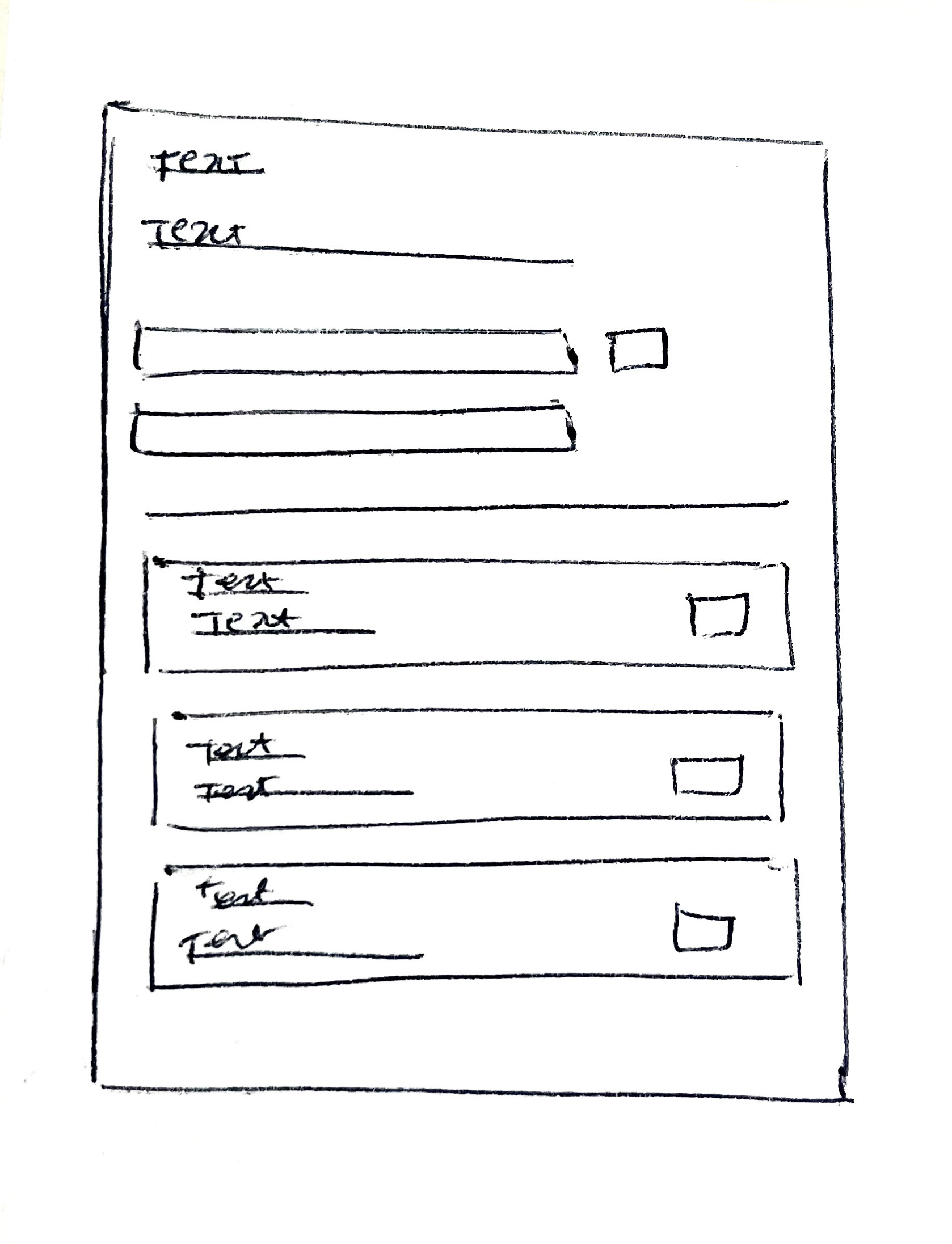
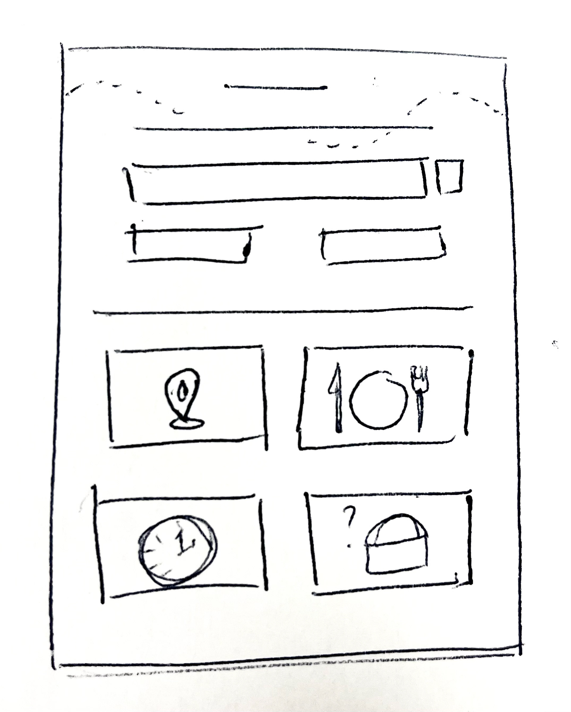
Designed a streamlined mobile app layout utilizing strategic typographic hierarchy and proximity-based information architecture, placing high-priority updates (destinations and boarding times) in heavier-weight font within thumb-friendly zones for user convenience. I used color to help display the flight status and the gate number to draw the viewer's eye.
INITIAL LAYOUT SKETCHES
COLOR PALETTE AND TYPEFACE